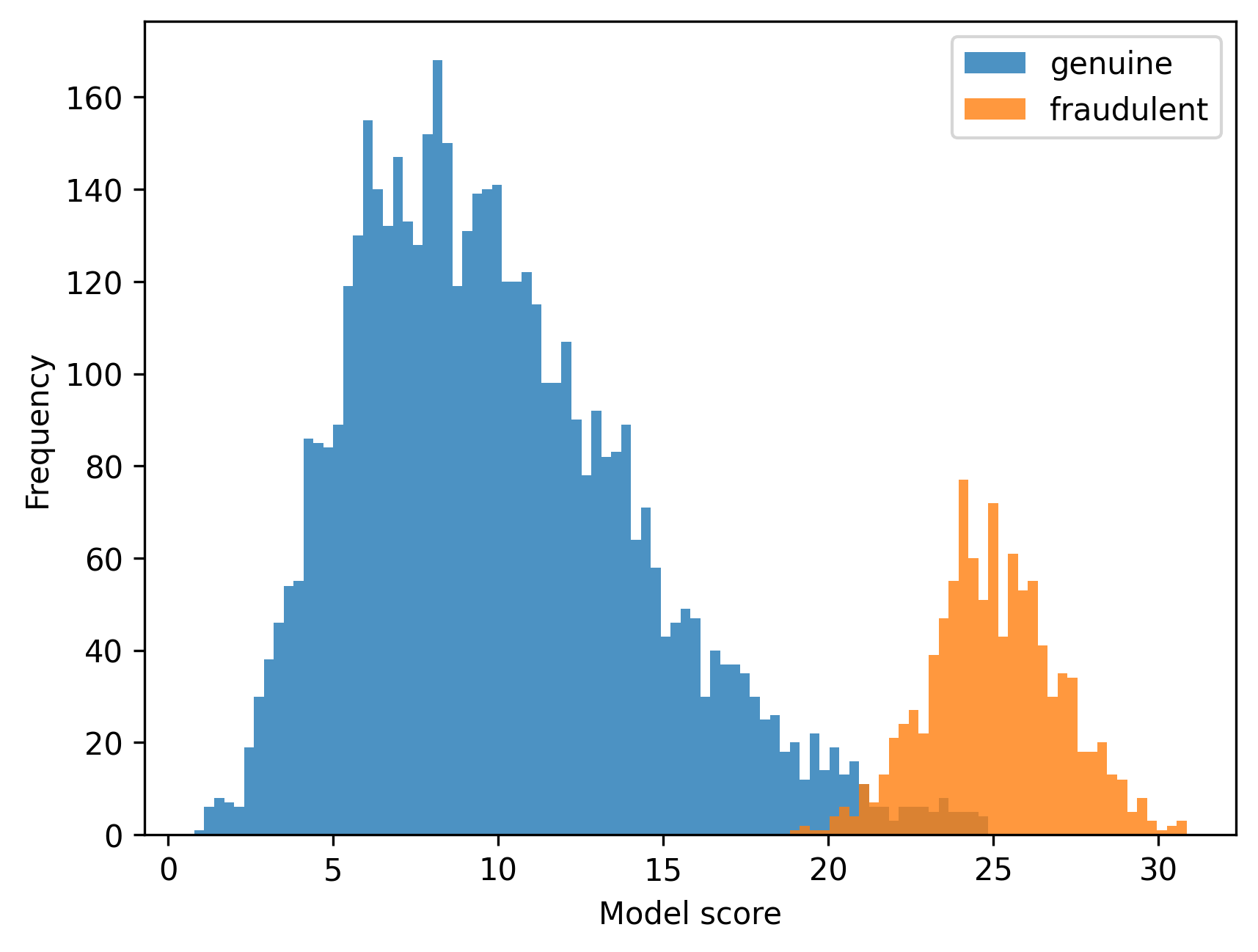
In computer vision research, ML model predictions are related to images. You often want to plot these predictions to get a sense of how well your model is doing on your data. For example, in fraud detection, you might want to plot a histogram of your model scores for both your genuine and fraudulent data, to see if and how these two distributions overlap. In such a context, it can be useful to be able to quickly inspect the images related to the scores. For example, you might want to have a look at the images that were not predicted correctly, i.e. fraudulent images that overlap with the genuine distribution, and genuine images that overlap with the fraudulent distribution. However, most common plotting libraries don't allow you to do that. You'd end up creating a histogram like this:
What do the genuine images in the fraudulent distribution look like? What do the genuine images close to zero look like? How are they different compared to the images in the middle of the distribution?
But this doesn't tell you much. You'd have to manually single out the images that you want to inspect in a separate process. In the most extreme, laborious cases this is done by saving images in a directory and inspecting them that way. Some libraries, such as bokeh make this a little bit easier, but the UX is not mainly made for inspecting images - you can hover over points to see an image, but that's about it. However, understanding data is not only about looking at an image, one at a time, at a glance. Understanding data means being able to zoom in on an image, view multiple images next to each other and see aggregate statistics of such a selection. Clusterfun allows you to do that. Let's dive into each of these components:
1. Hover to inspect
In a plot, you can quickly hover over images. Hovering does not only show you the image, but also the metadata associated with the image. For example, you can see a model score, the image location, and any other metadata you added to the dataframe used to create the plot.
2. Select to inspect
Hovering over images is fine for a quick glance at the data, but looking at multiple items at the same time can give you a much better sense of your data distribution. This allows you to e.g. quickly spot similarities between images that are wrongly predicted.
3. Statistics of a selection
Once you have a selection of data points, it can be helpful to see aggregate statistics of a selection. In the example below, you can see how we can dive into particular subsets of a dataset. Here, we see a group of paintings that look very similar, but are still from different painters. Picasso and Braque made a few very similar paintings! Clusterfun allows you to quickly inspect such subsets of your data.
The above features make it easier to truly understand your data, and give you the flexibility to explore your data in a way that works for you.